


March 2013
Dear Reader,
Ernest Hemingway was known for his simple and direct writing, both “economical and understated.” It was this beautiful simplicity that the Nobel Foundation recognized in awarding him the highest honor in literature.
In this newsletter we take inspiration from Hemingway with an article on designing excellent charts. We focus on the process of deciding if you need a chart, what story it needs to tell, and then communicating that story in a direct and compelling way.
Other items of interest in this newsletter include:
- Why I Love Creating PR Surveys
- The Best Way to Record Phone Interviews
- Get Smart This Summer
- What Data Can’t Do
- Seeing Red, Consumers Pay More (or Less)
- Survey Reveals Critical Moments for Employee Engagement
- Tips on “Reverse Wording” Survey Questions
- Statistics Unite the World in 2013
- Snowing the Boss with Data
- New Year’s Research Resolutions
- The Five Most Read Versta Posts in 2012
- 28 Questions to Ask before Buying Online Sample
- How to Know If a Brand Extension Will Succeed
We are also delighted to share with you:
As always, when your next research project comes along, please do not hesitate to give us a call for our thoughts and a proposal.
Warm regards,
The Versta Team
How to Design an Excellent Chart
“Show the readers everything, tell them nothing.”
—Ernest Hemingway
That’s (mostly) our mantra when it comes to turning data into stories. Show data in direct, compelling, detailed, truthful ways. And cut the endless verbiage explaining what percentage of respondents said what to which questions.
Charts are a critical piece of this. They are an ideal way to “show everything and tell nothing” as Hemingway advises. They help us “open up” and show the story implicit in the data.
But it’s not easy. There are two phases of the research process that consume about 80% of our creative and intellectual efforts. The first is research design: carefully articulating the problem to ensure that the data we get will speak to exactly what we need. The second is reporting and presentation: figuring out how to wrangle data into clear, compelling, transparent stories—one piece of which involves choosing, creating, and revising charts to help tell that story.
What makes designing excellent charts so hard? Every chart can and should carry a whole story line with several subthemes and lots of supporting data points. As if turning data into stories weren’t hard enough, now we have to distill that story even further into a chart that says it all.
Here are the steps we go through in designing excellent charts. We go through each of these steps multiple times, with many revisions, sometimes at an agonizingly slow pace. They key is to focus on the conceptual process of turning data into stories, rather than focusing on individual pieces of that process like what colors to use or which type of chart to choose.
1. Is a chart really best?
The curse of a generation growing up with PowerPoint is that for nearly every data point we want to communicate, we begin thinking of charts. “Should I use bar chart here, or a line chart? Should I show the data split by age groups? Should I try to superimpose a line onto another chart instead?” It is a reflex that does not always serve us well, because charts are not always best.
If data are extremely simple, then a chart offers no value. It doesn’t help a person grasp or intuit the information any better than a word. Or, as Edward Tufte notes , “Why waste the power of data graphics on simple linear changes, which can usually be better summarized in one or two numbers?”
Likewise, long lists of data that do not show trends, or lists of data points not meant to be compared, rarely benefit from being shown in charts. If you find a chart getting messy and complex with no obvious way to cut data and focus on key points of contrast, then try putting that data into a table. Chances are you will decide that a chart is not really best.
2. Identify the contrast you want to show.
Charts are powerful because they encourage us to compare data points visually and to explore variation. In fact, every chart will invite the reader to make comparisons, so it is critical to identify precisely the contrast you want to show. This depends, of course, on the story you want to tell.
Do you need to highlight differences among sub-groups of respondents? Or do you want to show overall differences and change over time? Or maybe you ought to highlight the number of people at one end of a spectrum versus those at the other end? Even with the same data, charts will differ based on the contrast you want to show.
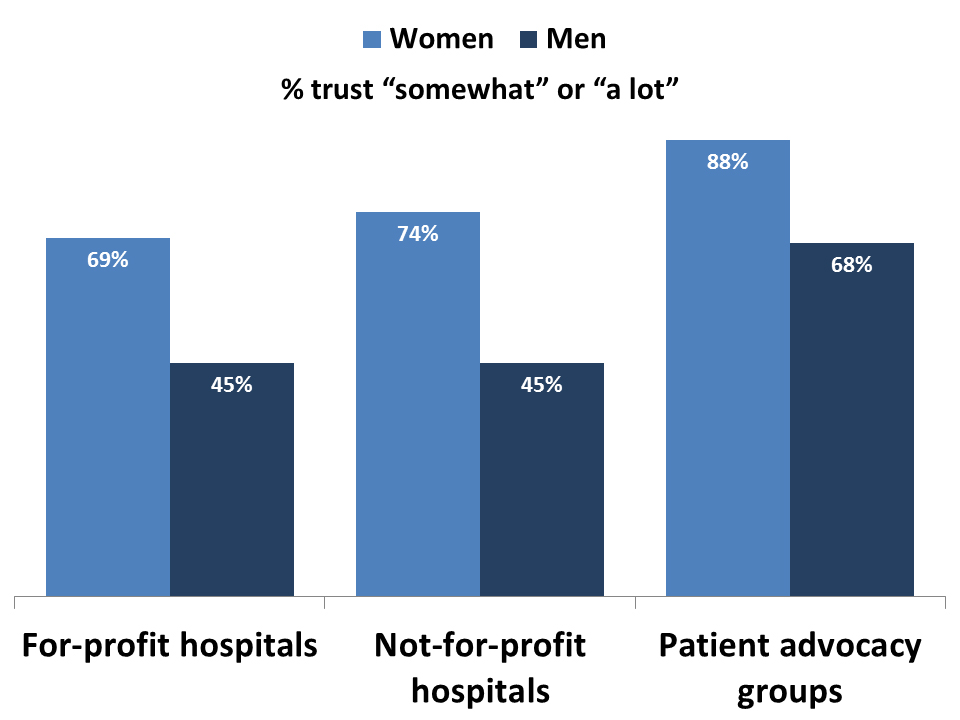
Here is an example of a chart that focuses attention on differences between men and women. The story is that women trust each type of organization more than men do.
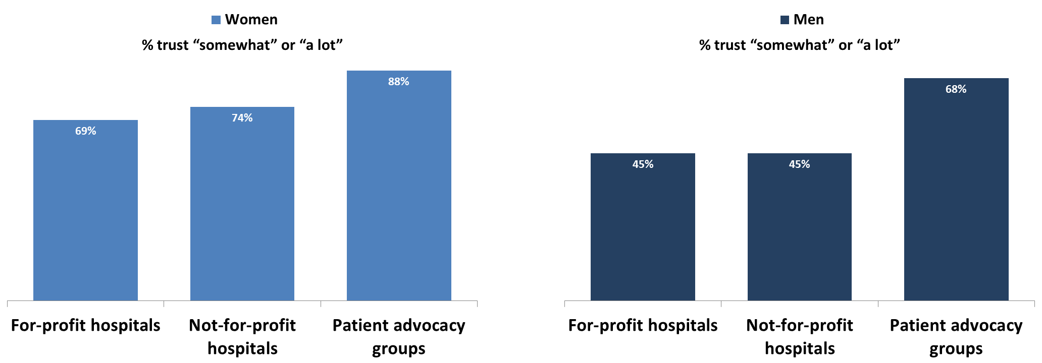
But if focal point of your story is that advocacy groups are more trusted than hospitals, then this next set of charts works better, as the main point of contrast is among organizations.
3. Consider multiple types of charts to show it.
There are two main criteria in selecting the type of chart to use. First, will it highlight the relevant point of contrast? Second, will it do it in a clean, intuitive, visually compelling, even beautiful, way?
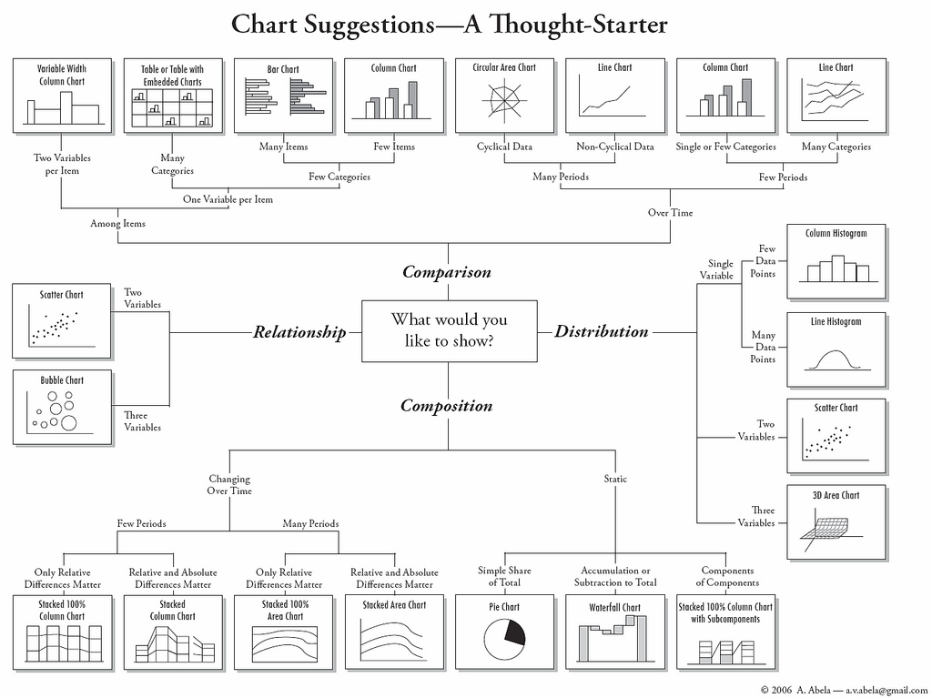
Nearly always we experiment with a whole gamut of charts: pie charts are (relatively) good for showing variation in responses to a single question; bar or column charts are good for showing variation among groups of respondents; line charts help show changes over time; scatterplots are ideal for showing correlation together with dispersion. Often we start with this handy flow chart from Andrew Abela, an expert on charts and presentations for businesses:
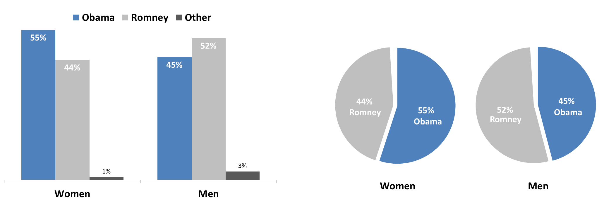
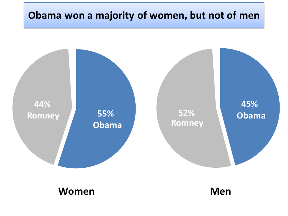
But once we cycle through our ideas and consider multiple options, we ignore rules like “avoid pie charts because viewers misjudge angles and surface area”) and settle on the chart that tells our story best. Here for example are two charts showing data from the 2012 presidential election. If the story we want to tell is that a majority of women, but fewer than half of men, voted for Obama, the pie charts on the right show this more immediately and forcefully:
4. Tell the story.
Next we show the chart to a colleague or client, asking her what story she sees. Every good chart will show a story without a narrative and without help from the presenter. If her answer doesn’t line up with the story we want to tell, then we try again. We keep at this until the chart shows the right story without our having to narrate.
And now we often deviate from Hemingway’s advice. As long as the chart tells the story without help from us, we add a headline, title, or caption—sometimes in the chart itself—that narrates the story as well. Sure we want the chart to speak for itself, but why risk having the reader get distracted with an ancillary point? For business presentations, it is hard to over communicate, so we say it once with the chart itself and we say it again with a caption or title. For example, here is how we might add a caption to the voter data shown earlier:
 We find that telling and showing the story together helps engage our audiences as they are listening to and glancing through our presentation of research findings.
5. Adjust based on best practices.
And then of course we revise, revise, and revise, as nearly all good story tellers do. True, we get better at incorporating best practices into the very process of designing and building. But it is always wise to review whether our charts conform to best practices as we revise and finalize the chart. Things like:
- Label all (or nearly all) numeric values on the chart
- Avoid three dimensional “tilting” of charts, as it distorts true proportions
- Avoid fill patterns; use solid colors instead
- Avoid grid lines, but if you use them, make them light gray
- Don’t exceed more than five or six slices on a pie chart
- Keep bars and columns relatively close together to encourage comparison
- … the list goes on!
For outstanding guidelines on best practices, we enthusiastically recommend any of Edward Tufte’s books (especially The Visual Display of Quantitative Information), Graphing Statistics & Data by Wallgren et al., and Show Me the Numbers by Stephen Few.
Dump the Dashboards
The most critical piece of advice these five steps highlight is this: Design charts thoughtfully, keeping focus on the story that needs to be told. Dump the fancy data visualization dashboard tools. Resist the urge to “click here!” for instant charts that effortlessly transform your piles of data into piles of useless charts.
In short, think carefully about what you need, identify the story, and build a chart that speaks with as much simplicity and elegance as Papa Hemingway himself.
Stories from the Versta Blog
Here are several recent posts from the Versta Research Blog. Click on any headline to read more.
Why I Love Creating PR Surveys
Good PR surveys are definitely not fluff. They demand a focus on objectives and a level of rigor unmatched by most other types of market research.
The Best Way to Record Phone Interviews
Recording telephone-based in-depth research interviews (IDIs) directly to a computer is easy and inexpensive. Here are the tools we use, and highly recommend.
Get Smart This Summer
Excellent research requires continual learning to stay on top of new knowledge and innovation. Here are five upcoming opportunities for truly top-notch training.
What Data Can’t Do
Data is powerful, but it does a lousy job on several important issues that are key to businesses and decision makers. Here are five areas where it falls short.
Seeing Red, Consumers Pay More (or Less)
New research shows the effect of color on a buyer’s willingness to pay. Red elicits aggression, which elevates auction bids but reduces negotiated offers.
Survey Reveals Critical Moments for Employee Engagement
Versta Research recently completed an 8-month study about when and how employers have the strongest impact on worker satisfaction. Here are 10 critical moments.
Tips on “Reverse Wording” Survey Questions
A best practice of survey design is to use multiple measures and reverse the direction of wording on some of them. Here are seven tips to doing it effectively.
Statistics Unite the World in 2013
Versta Research is participating in the International Year of Statistics, along with other agencies, universities and research groups from around the world.
Snowing the Boss with Data
What would you do if you got a request like this from Dilbert’s pointy-haired boss for mountains of incomprehensible and boring data that everyone will ignore?
New Year’s Research Resolutions
Versta Research suggests five resolutions for the market research industry that will make research in 2013 more valuable, relevant, and useful than ever before.
The Five Most Read Versta Posts in 2012
Now in its fifth year, the Versta Research blog is read widely by clients and colleagues alike. These are the articles most sought during the year 2012.
28 Questions to Ask before Buying Online Sample
New guidelines from ESOMAR outline 28 questions every buyer of sample for online surveys should ask, including questions about routers, rivers, and more.
How to Know If a Brand Extension Will Succeed
The most important predictor of brand extension success is whether potential buyers see it as a good “fit.” So there is just one question your research should ask.
Versta Research in the News
Boomers with Pensions Retiring in Debt
Even with traditional defined benefit pensions plans, almost half of boomers are retiring with debt according to a new Fidelity Investments survey conducted by Versta Research. Findings have been featured in Plan Sponsor Magazine, Financial Advisor, and other media outlets.
Recently Published
The Employee Experience Survey
Results from a new study identify key moments in the lifecycle of an employee—from first inquiries about a job opportunity to exit interviews and transitions to new jobs—that can make or break positive employee engagement.
MORE VERSTA NEWSLETTERS